Color Tattoos on Every Skin Tone: Finding Your Palette, Understanding Pigment, and Making Your Tattoo Last
By Red Baron Ink Tattoo & Piercing | West Village, New York City
When the Colors You Love Aren’t Necessarily the Colors That Work Best
A client once visited our studio with a beautiful vision for a watercolor tattoo. She had carefully selected her inspiration: soft lavender, delicate pastel pinks, subtle purples, and flowing washes of color. It was a gorgeous concept, and we understood exactly why she loved it.
But during the consultation, an important conversation came up.
The client had a deep, richly pigmented complexion, and the particular combination of pale colors and delicate transitions she wanted might not have produced the contrast or healed appearance she was expecting.
Explaining that wasn’t easy.
Understandably, she was disappointed. She had fallen in love with a particular image and wanted to see it recreated on her skin.
But there’s a difference between saying a tattoo cannot be done and explaining that a design may need adjustments to achieve the result someone wants.
And that brings us to one of the most important words in tattooing: compromise.
Not compromising your identity, your creativity, or the meaning behind your tattoo. Rather, finding the right balance between your vision, the artist’s experience, and the way pigment interacts with your skin.
Because a great tattoo isn’t just about how it looks when it’s freshly completed. It’s about how it heals, how it ages, and how you’ll feel wearing it years from now.
Your Skin Is Part of the Color Palette
When you look at a tattoo design on a white sheet of paper or a bright digital screen, you’re seeing colors without the influence of skin pigmentation.
Once those same colors are tattooed, the result changes.
Tattoo ink is deposited in the dermis, beneath the outermost layer of skin, known as the epidermis. Melanin, the pigment responsible for much of our natural skin color, influences how we perceive the tattoo underneath.
Think of it as looking at a painting through a tinted window.
The painting is still there, but the colors you see are influenced by the tint.
On lighter complexions, certain pale colors may appear brighter or more distinct. On deeper complexions, those same colors may look softer, more muted, or less defined.
This doesn’t mean people with darker skin cannot have colorful tattoos. They absolutely can.
It means the palette, contrast, saturation, and design need to be considered thoughtfully.
Understanding Warm, Cool, and Neutral Undertones
Two people can have similar skin tones but very different undertones.
Skin tone refers to the overall lightness or depth of your complexion. Undertone refers to the subtle warmth, coolness, or neutrality beneath it.
Warm undertones often have golden, yellow, peach, or olive influences.
Cool undertones may have pink, reddish, or bluish influences.
Neutral undertones combine characteristics of both.
These differences can influence how tattoo colors appear once healed, but they are not rigid rules.
Someone with warm undertones isn’t limited to warm tattoo colors, just as someone with cool undertones doesn’t have to avoid orange or red.
The more useful question is: Which colors create enough contrast and complement the overall design?
Exploring Tattoo Color Palettes
There is no universal list of tattoo colors that works for everyone. Still, certain palettes can be useful starting points.
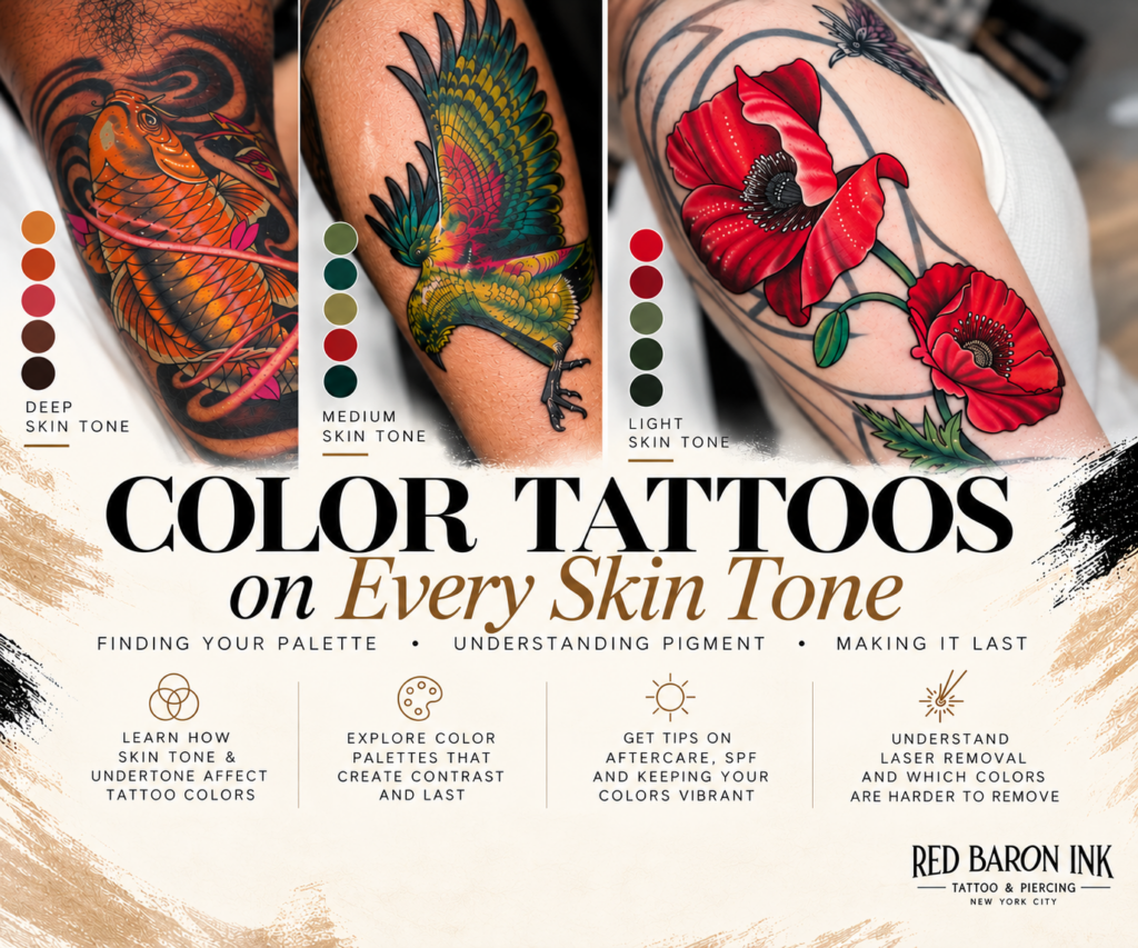
Warm and vibrant palettes
- Rich reds and crimson
- Burnt orange and terracotta
- Magenta and deep pink
- Copper-inspired and rust tones
These shades may work beautifully in floral tattoos, traditional designs, illustrative pieces, and other compositions where warmth is part of the artistic vision.
On some deeper complexions, saturated reds, oranges, and magentas can create appealing contrast, although the healed result will depend on the individual skin tone and pigment.
Cool and jewel-toned palettes
- Royal blue and cobalt
- Emerald and saturated green
- Deep violet and plum
- Teal and blue-green
These colors can create striking combinations, especially when paired with thoughtful shading, open space, and clearly defined shapes.
Not every blue or purple will behave the same way. A saturated violet and a pale lavender, for example, may produce very different healed results.
Earth-inspired palettes
- Terracotta
- Rust
- Deep olive
- Warm red-brown
- Muted gold-inspired shades
Earth tones can produce beautiful, organic compositions, but they aren’t automatically the best choice for darker skin.
Some browns and muted shades may blend too closely with the surrounding complexion to provide enough contrast.
The goal isn’t simply choosing colors that match your skin. It’s choosing colors that remain visible and support the artwork.
Soft pastels and watercolor palettes
- Lavender
- Baby pink
- Pale peach
- Mint
- Soft yellow
- Powder blue
Pastels can create delicate, beautiful tattoos, but they often depend on subtle contrast.
When those subtle differences become less visible after healing, the design may lose some of its intended dimension.
This is especially important with watercolor tattoos, where soft transitions, minimal outlines, and lighter pigments may be central to the design.
Sometimes the solution is to introduce more saturated colors, stronger contrast, or selective outlines while preserving the watercolor aesthetic.
Why Contrast Matters More Than Following a Color Rule
A tattoo doesn’t need to contain every color in the rainbow to be beautiful.
In fact, sometimes a more selective palette creates a stronger piece.
Consider a floral design featuring pale pink petals, lavender shading, and light yellow highlights.
Depending on the client’s complexion, those colors might blend together after healing.
Now imagine adjusting the design to include a richer magenta, a deeper violet, and more defined areas of contrast.
The overall concept remains the same, but the tattoo may have greater visual clarity.
This is why an experienced artist should consider the complete composition rather than choosing ink colors in isolation.
Size, linework, shading, placement, negative space, and contrast all work together.
And sometimes, black and gray may be the better artistic choice.
Not because someone can’t wear color, but because black and gray might achieve the contrast, detail, or longevity they’re looking for.
Do Color Tattoos Fade Faster Than Black and Gray?
This is one of the most common questions clients ask.
The answer is that some colors can lose visibility or change in appearance more noticeably than black ink, but there is no single fading timeline that applies to every tattoo.
Black tattoos often maintain strong visual contrast, even as the pigment softens over time.
Lighter colors, delicate highlights, and low-contrast details may become less noticeable sooner.
Several factors influence how a tattoo ages:
- The specific ink pigments used
- Sun exposure
- Tattoo placement and friction
- Application technique
- Design size and detail
- Individual skin characteristics
- Healing and long-term skin care
A well-executed color tattoo can remain beautiful for many years. The important thing is understanding that the healed result won’t necessarily look identical to the fresh tattoo.
That’s true for every skin tone.
Keeping Your Color Tattoos Looking Their Best
One of the simplest ways to protect your tattoo is also one of the most important: sunscreen.
Ultraviolet exposure can contribute to tattoo fading.
Once your tattoo is fully healed, use a broad-spectrum, water-resistant sunscreen with SPF 30 or higher when the area is exposed to sunlight. Reapply as directed, especially when spending extended periods outdoors.
Fresh tattoos should follow the artist’s healing instructions and be protected from direct sun exposure.
Moisturizing also matters.
Healthy, hydrated skin can make an existing tattoo appear smoother and more vibrant, particularly when dryness has left the surface looking dull.
At Red Baron Ink, we also carry tattoo-care products designed to condition the skin and enhance the appearance of healed tattoos.
It’s important to understand what these products can and cannot do.
A moisturizing or tattoo-enhancing product may temporarily make existing colors appear richer, but it cannot restore pigment that has genuinely faded or disappeared from the skin.
Think of it as caring for the surface through which you see the artwork, rather than replacing the ink itself.
What If You Want to Remove a Color Tattoo Later?
Here’s something worth considering before choosing your palette: not all tattoo colors respond equally to laser removal.
Laser tattoo removal works by using light energy to break tattoo pigment into smaller particles that the body can gradually clear.
Different pigments absorb different wavelengths of light, which means multicolored tattoos may require different laser technologies and multiple treatment sessions.
Generally speaking, black and dark blue inks are among the easier colors to target.
Green, red, and yellow can be more challenging, depending on the pigment and laser technology.
White and flesh-colored pigments can be especially unpredictable. Some may darken during laser treatment, making removal more complicated.
Laser removal also carries risks of scarring and changes in natural skin pigmentation, which deserve particular consideration for people with deeper complexions.
Removal is never guaranteed to be complete.
That’s another reason we encourage clients to think carefully about their design, colors, and long-term expectations before committing.
A Good Tattoo Consultation Is a Conversation
Going back to the client who inspired this article, the important lesson wasn’t that her original vision was wrong.
It was that her design deserved a conversation about what could realistically be achieved.
Clients should feel comfortable expressing what they love, and artists should feel responsible for explaining the technical considerations that may affect the finished result.
Sometimes that means recommending a richer shade of purple instead of lavender.
Sometimes it means adding stronger outlines to a watercolor composition.
Sometimes it means increasing the size of a design or introducing more negative space.
And sometimes it means deciding that black and gray will better serve the artwork.
These conversations aren’t about limiting creativity.
They’re about protecting it.
Your Skin Tone Should Be Part of the Design, Not an Afterthought
Whether your complexion is fair, olive, golden, medium brown, deep brown, or anywhere in between, color tattoos can be an incredible form of self-expression.
The key is understanding that the same ink can look different on different people.
Before committing to a color tattoo, ask your artist to show you examples of healed work on skin tones similar to yours. Discuss the palette, the contrast, the size, and what you can reasonably expect years down the road.
At Red Baron Ink Tattoo & Piercing in Manhattan’s West Village, we believe the best tattoo decisions begin with open conversations and realistic expectations.
Because your skin isn’t a blank white canvas.
It’s part of the artwork.
And the right color palette should work with it, not against it.
Thinking about a custom color tattoo? Explore our artists’ portfolios at rbitattoo.com and submit a tattoo inquiry to start the conversation.
